
Flow_models 2: Image generation and anomaly detection as two sides of the same coin.
- The examples in this series are all computed with the scripts in my https://github.com/aganse/flow_models repo in Github.
- Links to articles in the series (also in nav menu above): 0.) Overview / Intro, 1.) Distribution mapping, 2.) Generative image modeling / anomaly detection, 3.) Generative classification (a), 4.) Generative classification (b), 5.) Ill-conditioned parameter estimation, 6.) Ill-posed inverse problem ignoring noise, 7.) Ill-posed inverse problem with noise in the data
Normalizing flow models (ie invertible neural networks, or INNs), like variational autoencoders (VAEs) and generative adversarial networks (GANs), offer a nice two-for-one benefit. They simultaneously enable unsupervised learning for image anomaly detection - by mapping unlabeled images to a latent space where statistical anomaly detection techniques can apply - and they also enable image simulation, by mapping randomly generated samples from the latent space into the image space. Now it may not be my ultimate use case, but it turns out there are, you know, a ton of cat images and datasets on the internet, so let's experiment with INNs and cats!
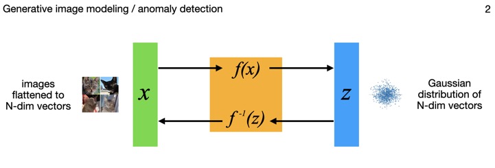
This diagram shows how the model inputs x, being N-dimensional vectors of flattened images, are mapped through the flow model to points z in an N-dimensional multivariate Gaussian latent space. And those points can each be mapped back though the model to images as well. The distribution is a standard normal (N-dimensional), so by construction has mean of zero and covariance as the identity matrix.
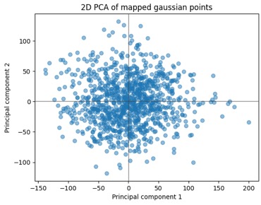
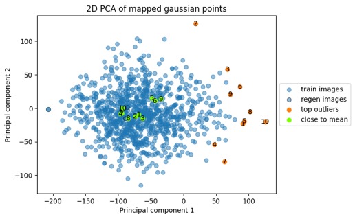
The images get their dimensions flattened into a single vector, so for example a (256, 256, 3) image tensor gets turned into a (196608,) one. That's a pretty high dimensional space, and note when the images are mapped through the flow model to the Gaussian latent space, the points there have that same dimension — so it's a really high-dimensional Gaussian distribution. To visualize the point cloud below, I'll use PCA to reduce the dimensionality down to 2D for plots. Now theoretically we already know the distribution is N(O, I), so if the covariance is I and it's really a random Gaussian point cloud, then it seems we could just plot any arbitrary choice of 2 dimensions and skip the PCA. However, that "theoretically" only applies after the model is fully and correctly trained, and again it's a fairly small dataset, in a very high-dimensional space, so taking the PCA route I can better verify what's happening.
Here's a 2D plot of the first 1000 points mapped from the dataset. Given the axis/data ranges, you might wonder, "Wait, wasn't this supposed to be N(O, I)? Those magnitudes are way larger than one!". And the answer to that is yes, but we did PCA, and the convention is to scale the results based on the eigenvalues you're reducing down to, so we're ok there. Also, to help with the small dataset I'm using data augmentation in the form of zooms, shears, and horizontal flips. To take a peek at how those effects map into the latent space, I then ran a few handfuls of images through a bunch of augmentations and mapped those into the latent space using the trained model. Interesting how we can see the clusters of the augmented points in the second plot there. I don't have strong conclusions about that at this stage, beyond just figuring the data augmentation has limits to how much it helps; maybe it can also help me to choose some better parameters for the randomized augmentation.
We'll come back to these clouds of points shortly, but next let's look at images some more. Now since the model by construction is reversible (they call it an invertible neural network for a reason!), we can take those points from the N-dimension Gaussian latent space and map them right back through the model to images. And we do get the original images back — in fact the first five cat images above were ones that I'd mapped through to latent-space points, and then mapped back again (they're the ones labeled "regen" in the plot farther below). This is as-expected — this part of the model behavior doesn't depend on the training of the model, as long as you're mapping back the exact latent-space point that came from an image originally. It's a reversible transformation. The much more interesting part is when we want to map points that did not originally come from images. And this part certainly does depend on the model training.
As to their quality, there is of course work left to do on the model and its training for this "sim-cats" application. In key research papers (e.g. RealNVP, Glow) that show photo-realistic human faces, the parameterizations of their models are significantly more complex implementations of these models (eg in number of nodes of coupling layers) and ~10x more data than I'm using here. The Glow paper (Kingma & Dhariwal 2018) shows in its Fig.9 the difference in images between a shallow version of their model (below left) and a deep one (below right), and the image differences look somewhat reminiscent of the cats above. Other factors like choices of specific architecture and regularization details and so on may play a role too; the specific choices I made for these images is in the repo linked at the top of the page. Meanwhile let's not worry about this much further here where the idea is to focus more on the big picture. But of course that detail-level is where all the "real" work is.
The five "sim-cats" above are highlighted in orange in the point cloud below, and again I'll clarify that they're not from the original training points (blue) or any other images; they're totally new samples randomly generated from the distribution. This point cloud below looks a little different shape than the plot above but it's the same point cloud — this time the rotation was to maximize the spread of these orange and green dots. We do need to keep the high-dimensionality in mind and the caveat that there are some limitations in how much we can interpret from these 2D plots. But when I see samples from distributions like this, I sure start thinking about anomaly detection. And anomaly detection via unsupervised learning is a prime use-case for these models. So let's look just a tiny bit at this side of it next.


In fact, this brings the question to mind, what do the most peripheral cat images in the training data look like compared to the more central ones? Is there a distinct visual difference? While I imagine the answer varies with what direction the vectors in question are in, I found an interesting pattern in the most distant ones.
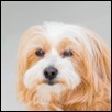
Here's the same point cloud again, with color highlighting the ten most extremal (via Euclidean distance from mean) points and the ten points closest to the mean. Those green closest-to-the-mean points aren't all on top of each other in this plot because the plot is a projection of a 1000+ dimensional point cloud down to 2D, with an orientation that maximizes the variance between the green and orange points rather than one that aligns the green points. In any case the plot visually confirms the extremal and central nature of the points.
 Here are five of those ten points closest to the mean:

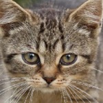

 and here are five of those ten most extremal points:
It appears that the white backgrounds got clumped together as a major feature regardless of the features of the cat itself, which we notice has a lot in common with the white backgrounded beachball images. While that particular behavior might not necessarily be a desirable one, in general this theme of different ends or locations in the distribution associating with different features in the images is a key aspect of the model one can take advantage of. The Glow model paper shows nice examples of interpolating points in the latent space between greatly differing images to get a "morphing" of one to the other, and even using binary labels to identify directions in the latent space that serve as a continuum for a given image feature (blond vs brown hair, smiling vs frowning, etc).
I could imagine that the existence of more interesting directional feature axes in the latent space may also depend on improving the clarity of the modeling (harkening back to the poor/blurry simulated images farther above). So probably should focus on first things first there.
- The examples in this series are all computed with the scripts in my https://github.com/aganse/flow_models repo in Github.
- Links to articles in the series (also in nav menu above): 0.) Overview / Intro, 1.) Distribution mapping, 2.) Generative image modeling / anomaly detection, 3.) Generative classification (a), 4.) Generative classification (b), 5.) Ill-conditioned parameter estimation, 6.) Ill-posed inverse problem ignoring noise, 7.) Ill-posed inverse problem with noise in the data
Normalizing flow models (ie invertible neural networks, or INNs), like variational autoencoders (VAEs) and generative adversarial networks (GANs), offer a nice two-for-one benefit. They simultaneously enable unsupervised learning for image anomaly detection - by mapping unlabeled images to a latent space where statistical anomaly detection techniques can apply - and they also enable image simulation, by mapping randomly generated samples from the latent space into the image space. Now it may not be my ultimate use case, but it turns out there are, you know, a ton of cat images and datasets on the internet, so let's experiment with INNs and cats!
This diagram shows how the model inputs x, being N-dimensional vectors of flattened images, are mapped through the flow model to points z in an N-dimensional multivariate Gaussian latent space. And those points can each be mapped back though the model to images as well. The distribution is a standard normal (N-dimensional), so by construction has mean of zero and covariance as the identity matrix.
Mapping images to a probability distribution
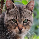
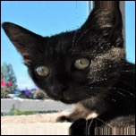
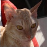
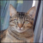
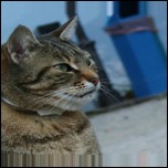
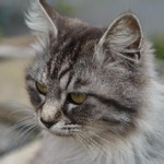
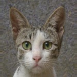
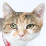
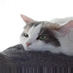
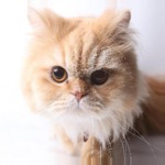
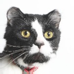
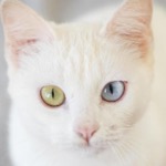
For this playing around with cats, I've been using the Kaggle Animal Faces dataset, which is about one-third cats, about 5600 images. That's not a ton of images but they're really nicely curated and consistent head shots; we'll come back to effects of the small dataset in a bit. The photos look like these examples:The images get their dimensions flattened into a single vector, so for example a (256, 256, 3) image tensor gets turned into a (196608,) one. That's a pretty high dimensional space, and note when the images are mapped through the flow model to the Gaussian latent space, the points there have that same dimension — so it's a really high-dimensional Gaussian distribution. To visualize the point cloud below, I'll use PCA to reduce the dimensionality down to 2D for plots. Now theoretically we already know the distribution is N(O, I), so if the covariance is I and it's really a random Gaussian point cloud, then it seems we could just plot any arbitrary choice of 2 dimensions and skip the PCA. However, that "theoretically" only applies after the model is fully and correctly trained, and again it's a fairly small dataset, in a very high-dimensional space, so taking the PCA route I can better verify what's happening.
Here's a 2D plot of the first 1000 points mapped from the dataset. Given the axis/data ranges, you might wonder, "Wait, wasn't this supposed to be N(O, I)? Those magnitudes are way larger than one!". And the answer to that is yes, but we did PCA, and the convention is to scale the results based on the eigenvalues you're reducing down to, so we're ok there. Also, to help with the small dataset I'm using data augmentation in the form of zooms, shears, and horizontal flips. To take a peek at how those effects map into the latent space, I then ran a few handfuls of images through a bunch of augmentations and mapped those into the latent space using the trained model. Interesting how we can see the clusters of the augmented points in the second plot there. I don't have strong conclusions about that at this stage, beyond just figuring the data augmentation has limits to how much it helps; maybe it can also help me to choose some better parameters for the randomized augmentation.
We'll come back to these clouds of points shortly, but next let's look at images some more. Now since the model by construction is reversible (they call it an invertible neural network for a reason!), we can take those points from the N-dimension Gaussian latent space and map them right back through the model to images. And we do get the original images back — in fact the first five cat images above were ones that I'd mapped through to latent-space points, and then mapped back again (they're the ones labeled "regen" in the plot farther below). This is as-expected — this part of the model behavior doesn't depend on the training of the model, as long as you're mapping back the exact latent-space point that came from an image originally. It's a reversible transformation. The much more interesting part is when we want to map points that did not originally come from images. And this part certainly does depend on the model training.
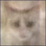
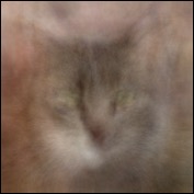
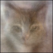
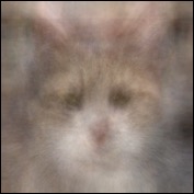
Mapping distribution samples back to images
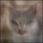
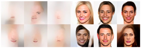
Here are some new randomly generated samples from that Gaussian distribution, that I mapped back through the model to the image space. Yes they're blurry and low quality in my toy project here at this stage. But you can definitely see cats there. These are completely generated out of the "catness" learned from the training images; in a generalized and highly nonlinear sense they are "interpolations" between the training images.As to their quality, there is of course work left to do on the model and its training for this "sim-cats" application. In key research papers (e.g. RealNVP, Glow) that show photo-realistic human faces, the parameterizations of their models are significantly more complex implementations of these models (eg in number of nodes of coupling layers) and ~10x more data than I'm using here. The Glow paper (Kingma & Dhariwal 2018) shows in its Fig.9 the difference in images between a shallow version of their model (below left) and a deep one (below right), and the image differences look somewhat reminiscent of the cats above. Other factors like choices of specific architecture and regularization details and so on may play a role too; the specific choices I made for these images is in the repo linked at the top of the page. Meanwhile let's not worry about this much further here where the idea is to focus more on the big picture. But of course that detail-level is where all the "real" work is.
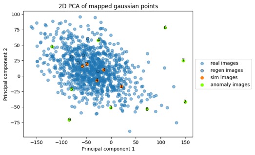
The five "sim-cats" above are highlighted in orange in the point cloud below, and again I'll clarify that they're not from the original training points (blue) or any other images; they're totally new samples randomly generated from the distribution. This point cloud below looks a little different shape than the plot above but it's the same point cloud — this time the rotation was to maximize the spread of these orange and green dots. We do need to keep the high-dimensionality in mind and the caveat that there are some limitations in how much we can interpret from these 2D plots. But when I see samples from distributions like this, I sure start thinking about anomaly detection. And anomaly detection via unsupervised learning is a prime use-case for these models. So let's look just a tiny bit at this side of it next.
Anomaly detection - identifying images that are different by comparing mapped points to distribution
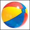
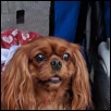
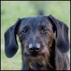
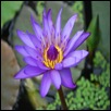
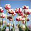
Now here are photos of nine other objects that I've mapped through to the Gaussian latent space with the same cat model, and plotted as the green points on the scatter plot above. You'll notice above that the green latent points for these non-cat images all end up on the periphery of the distribution; the idea being that we could use some statistical methods to generate a probability of whether a picture is of a cat — without ever having any labels.In fact, this brings the question to mind, what do the most peripheral cat images in the training data look like compared to the more central ones? Is there a distinct visual difference? While I imagine the answer varies with what direction the vectors in question are in, I found an interesting pattern in the most distant ones.
Here's the same point cloud again, with color highlighting the ten most extremal (via Euclidean distance from mean) points and the ten points closest to the mean. Those green closest-to-the-mean points aren't all on top of each other in this plot because the plot is a projection of a 1000+ dimensional point cloud down to 2D, with an orientation that maximizes the variance between the green and orange points rather than one that aligns the green points. In any case the plot visually confirms the extremal and central nature of the points.
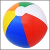
It appears that the white backgrounds got clumped together as a major feature regardless of the features of the cat itself, which we notice has a lot in common with the white backgrounded beachball images. While that particular behavior might not necessarily be a desirable one, in general this theme of different ends or locations in the distribution associating with different features in the images is a key aspect of the model one can take advantage of. The Glow model paper shows nice examples of interpolating points in the latent space between greatly differing images to get a "morphing" of one to the other, and even using binary labels to identify directions in the latent space that serve as a continuum for a given image feature (blond vs brown hair, smiling vs frowning, etc).
I could imagine that the existence of more interesting directional feature axes in the latent space may also depend on improving the clarity of the modeling (harkening back to the poor/blurry simulated images farther above). So probably should focus on first things first there.